Simon Sharville Graphic Design : Branding

Branding and Identity

What's in a logo

I’m often asked to just design a logo for someone and place it on a business card or some stationery. I feel that for some, a logo is nothing more than an afterthought, like turning up in a nice suit but wearing a funny hat because it was raining. In reality however, brand and identity is so much more. Type, tone-of-voice, colours , imagery, space and composition all create a visual language that represents how you wish to be seen and perceived. It can range from just a business card, to a full blown set of guidelines, but every element should be considered and thought through.
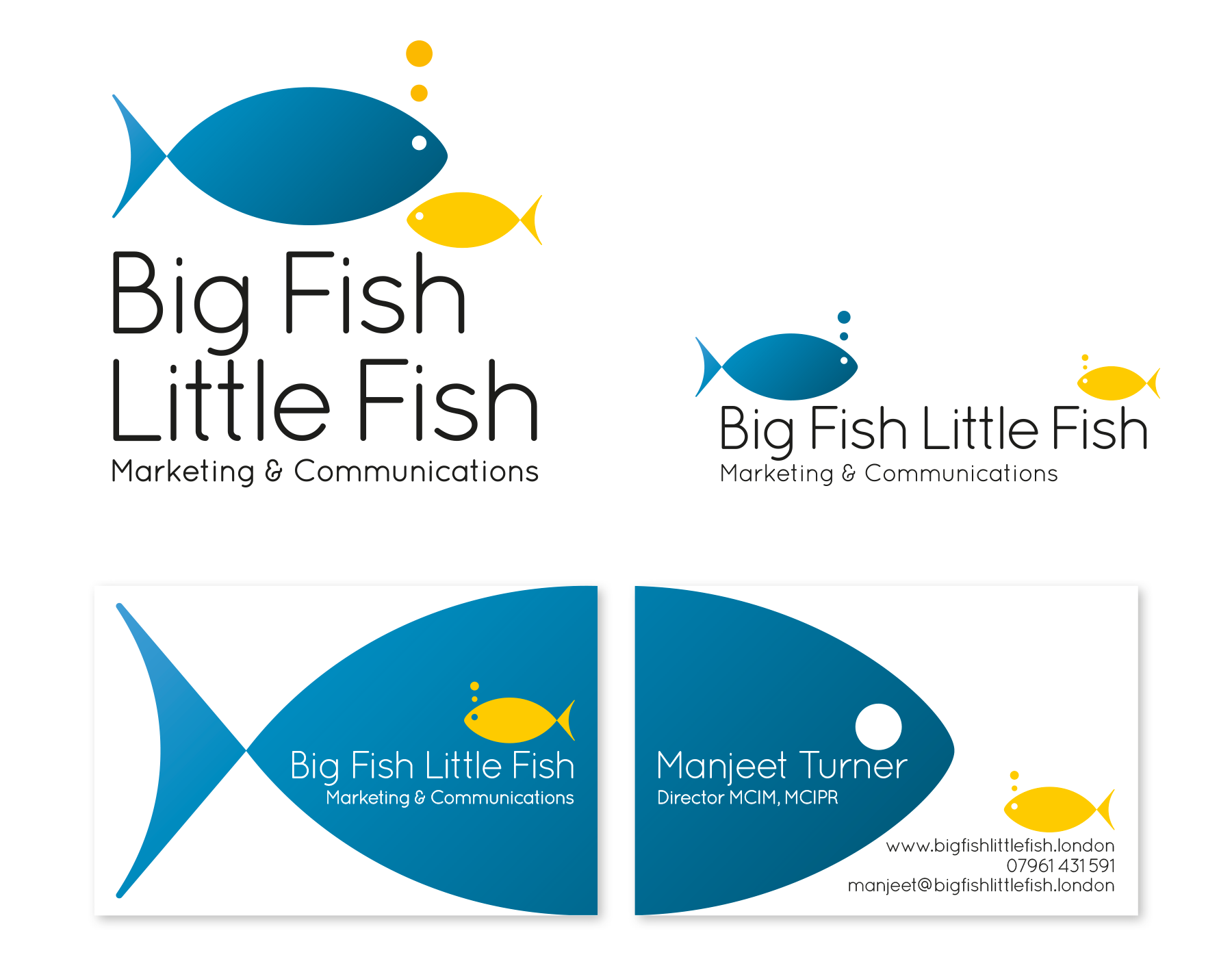
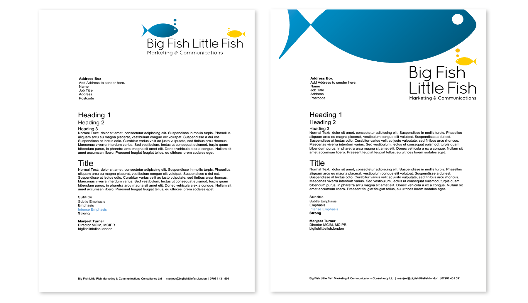
Big Fish Little Fish

Branding and stationery

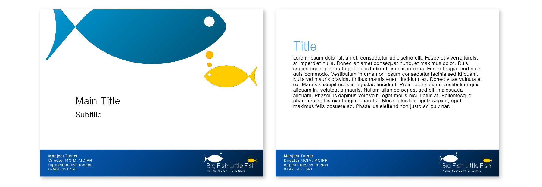
Branding designs for Big Fish Little Fish, a small communications and marketing agency that advises some big clients.

Association of Illustrators

Identity and stationery

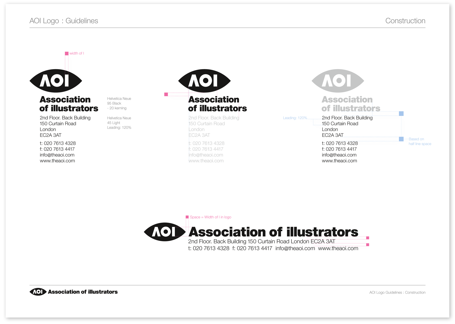
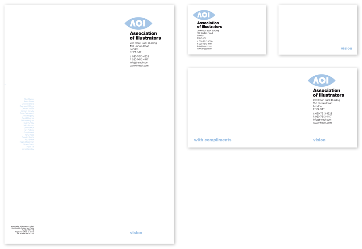
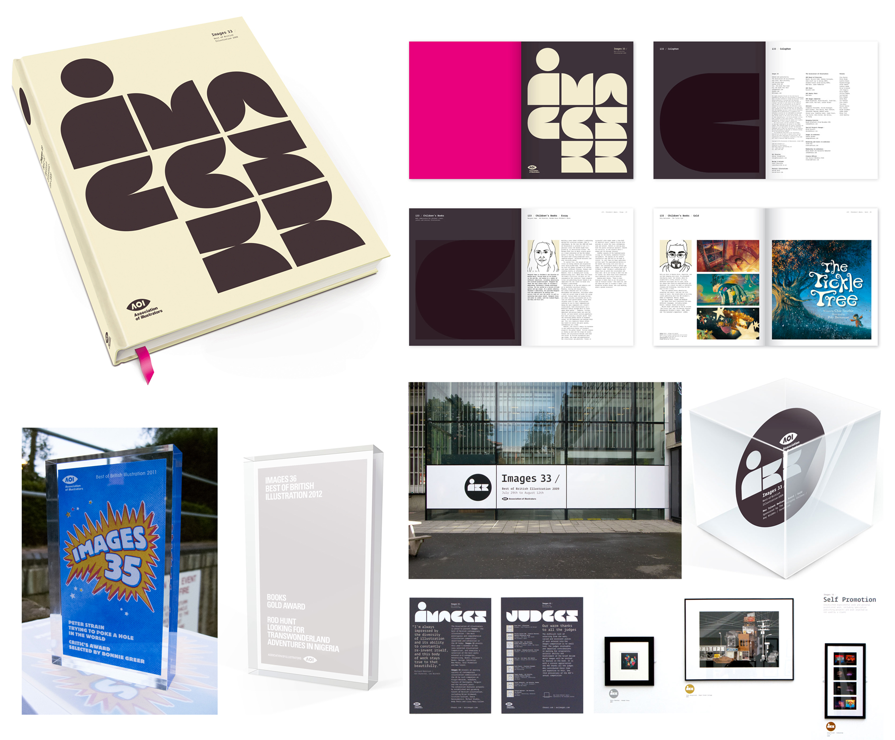
Design of the identity and stationery for the AOI. The brief was to evolve the existing brand, making it stronger and more contemporary, but to retain the overall image of the organisation, bring all stationery and mailout into this format and also carry it through to any future projects.

Debenhams

Brand Identity and Signage

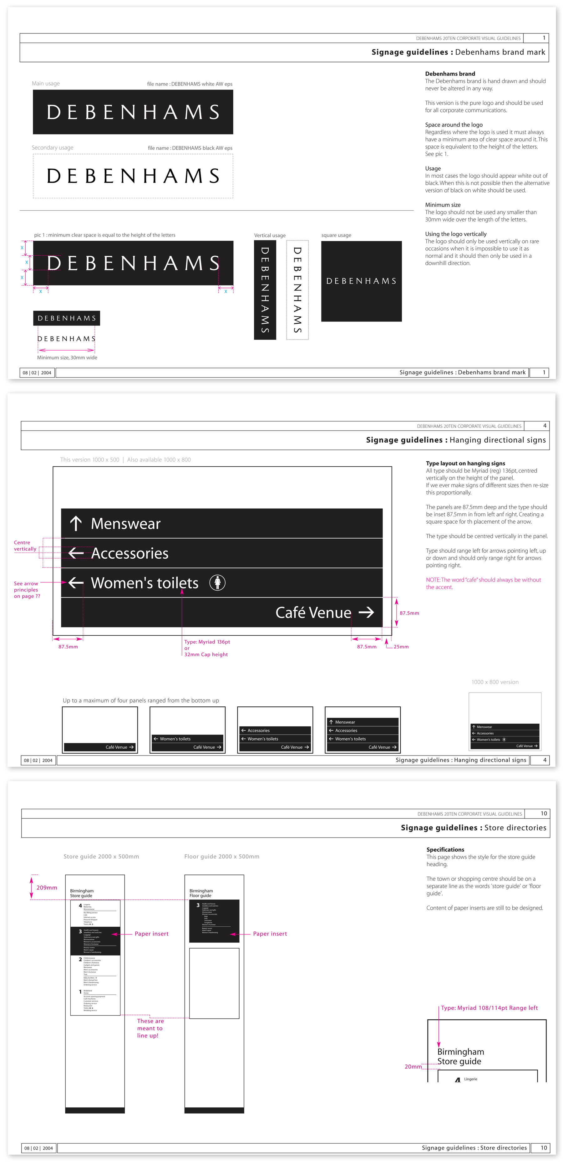
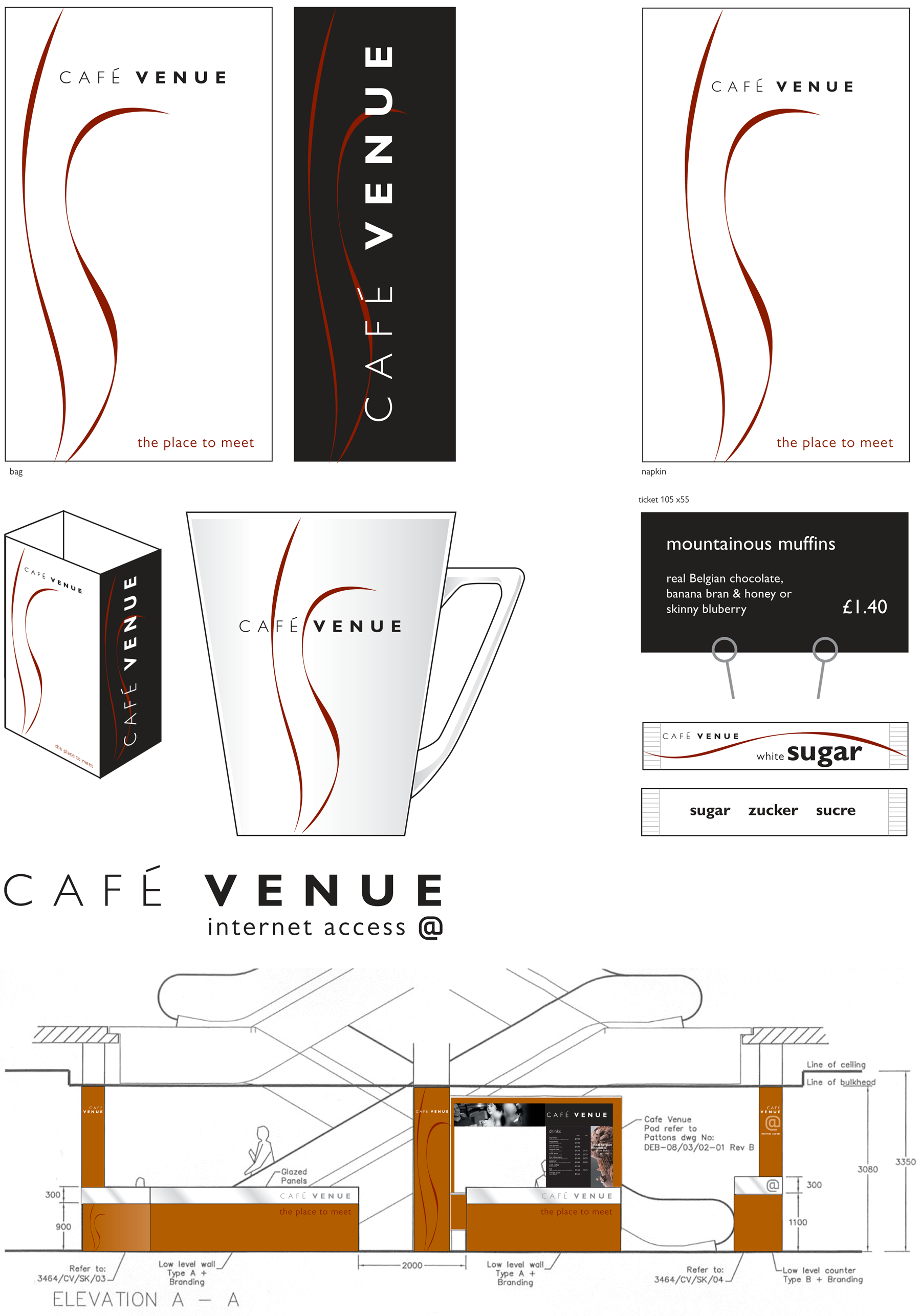
As a key member of the in-house design team, it was my role to look at evolving the branding of the company. We decided to remove the existing blue used throughout the stores and make the brand, signage and any other material, black and white. We introduced a new typeface and implemented that across all signage and ticketing.

Corporation of London

Street Signage System

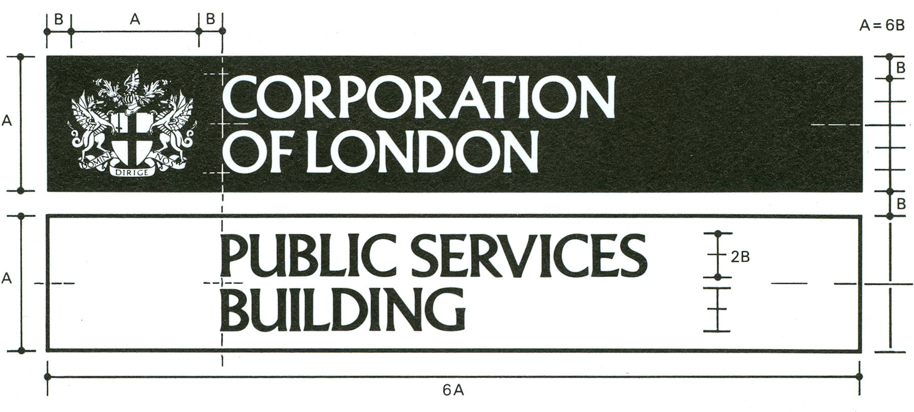
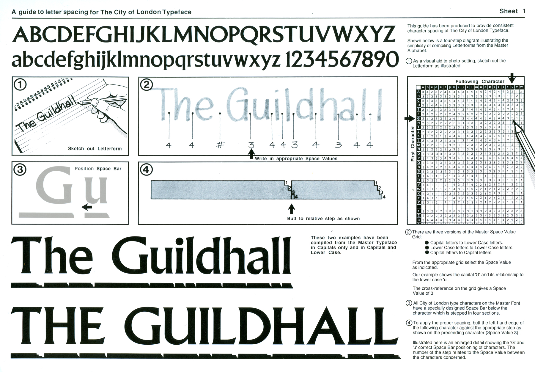
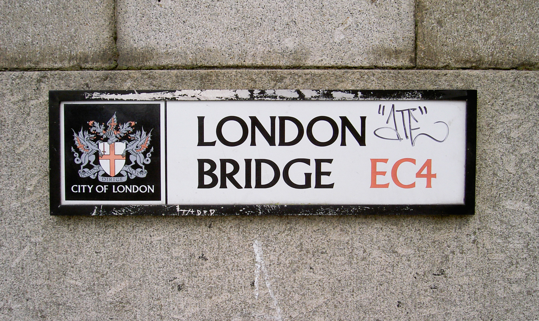
Early in my career I was involved in helping to create a street signage system for the City of London. We had a typeface cut and we created a letter spacing system. This system used a cross reference chart where each character used 1 of a 4 step space bar relating to the character before it. By using this system all the signage across the City would have a consistency regardless of who created it.

SARD

SARD Identity

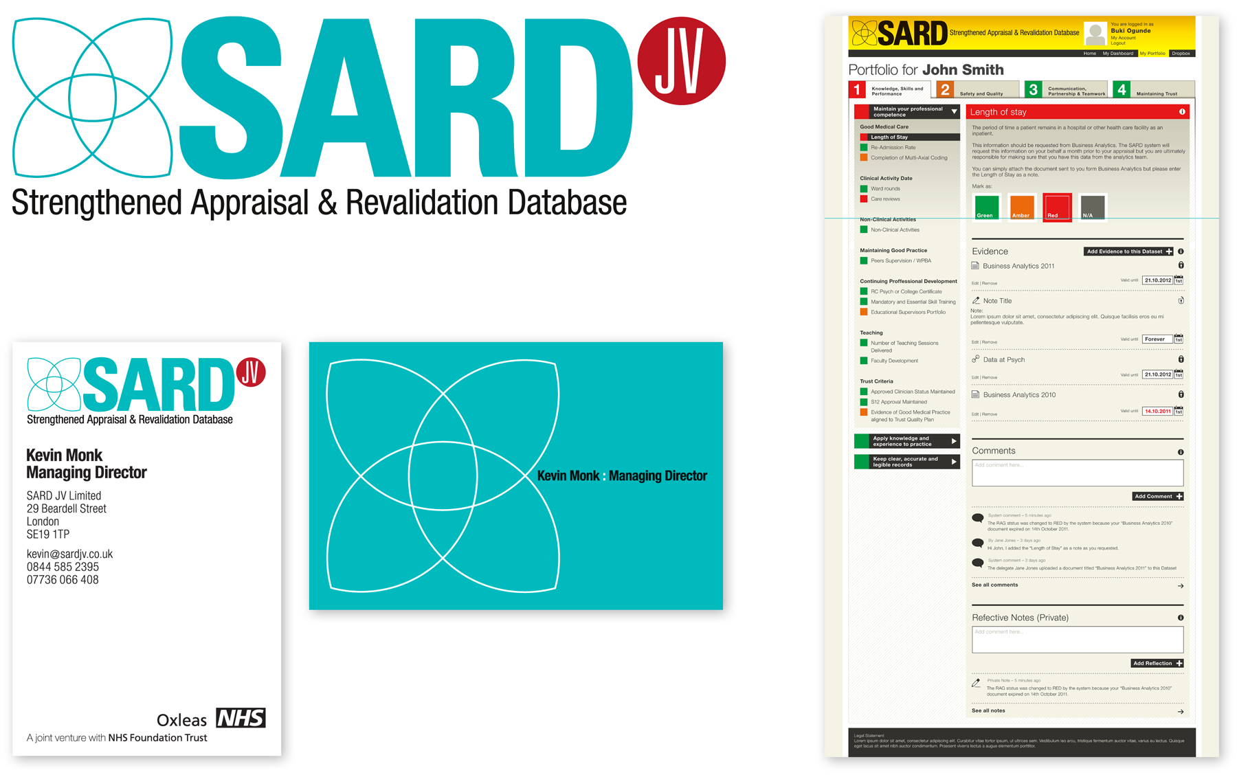
SARD is an online appraisal database for a division of the NHS. Working closely with the developers, I created a Brand ID, Business Cards and designed the structural look of their system.

SARD Brand Refesh

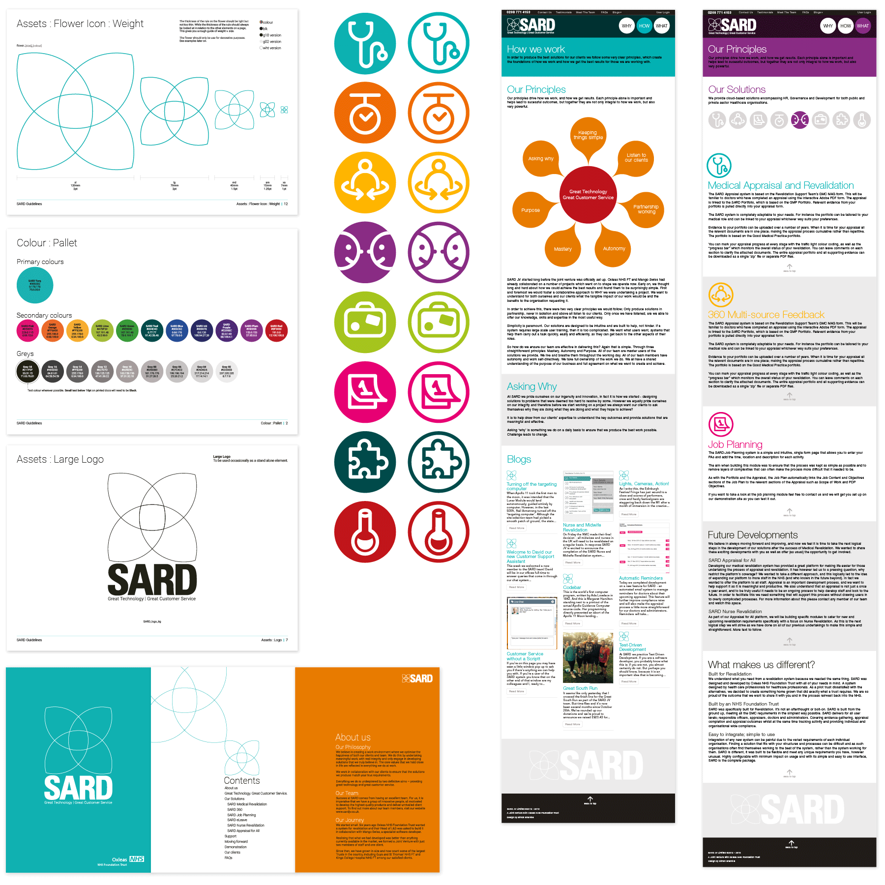
Having designed the original identity, website and appraisal system for SARD and as the company had grown offering more solutions they returned requesting a refresh. Keeping the original look and feel I made some changes to the logo, created a series of icons and updated the look of the website. This also included a more comprehensive set of guidelines and some brochures.

Southwark Council

Future Peckham Identity

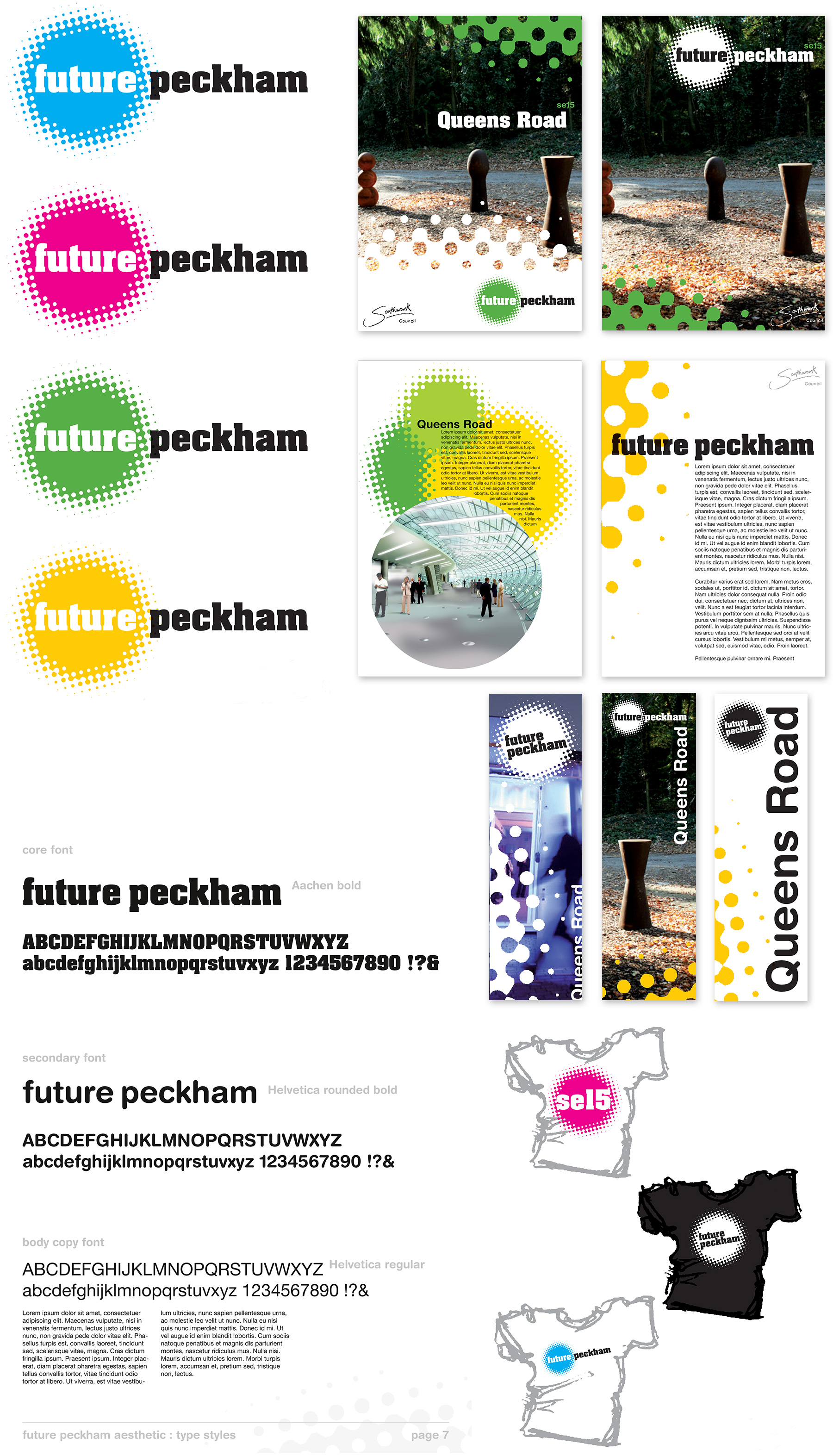
I was commissioned by Southwark Council to design some regeneration branding and signage. The brief was an identity to be used across all printed literature and projects related to the area.

Wildstone Outdoor Media

Brand identity and website

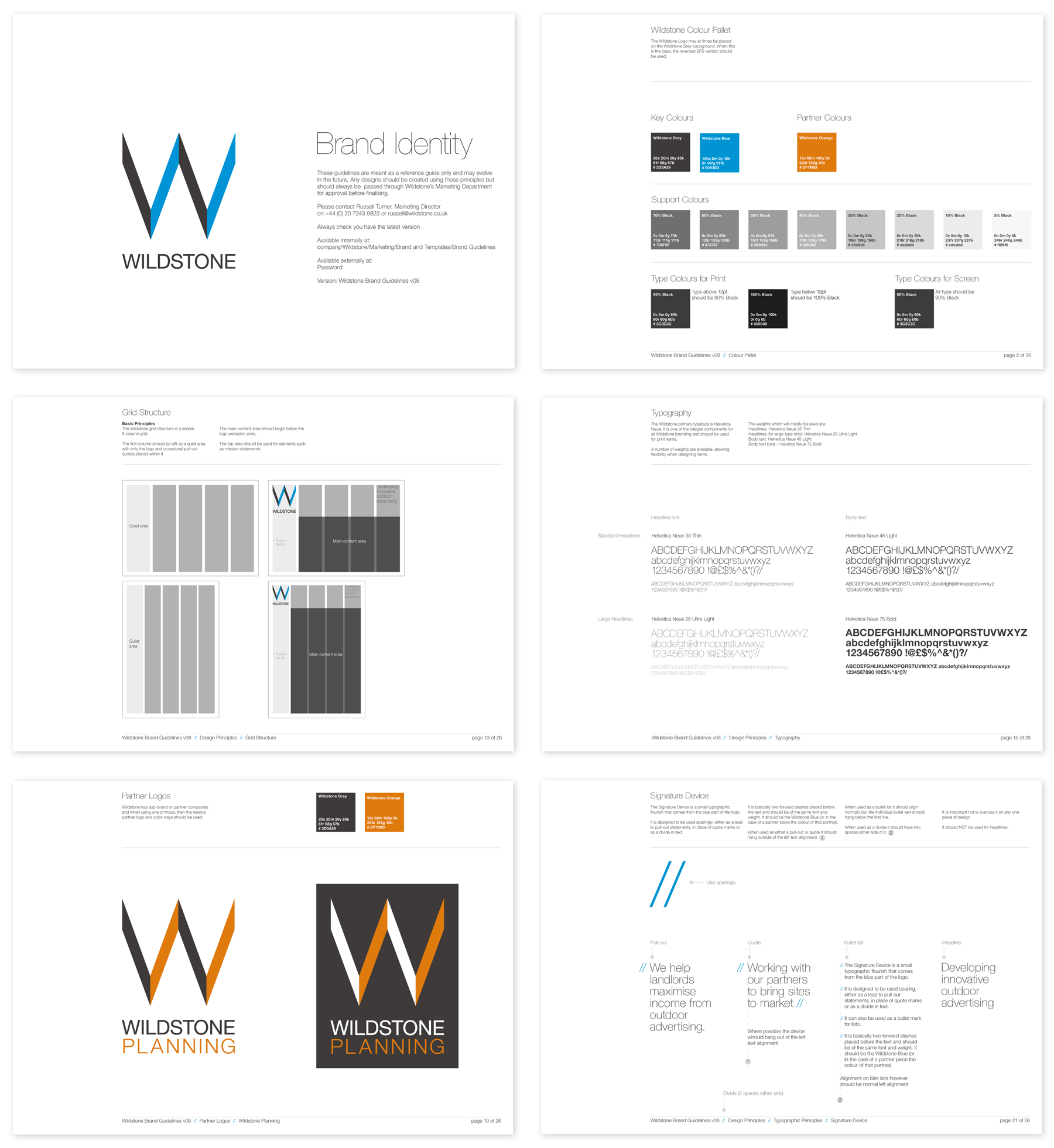
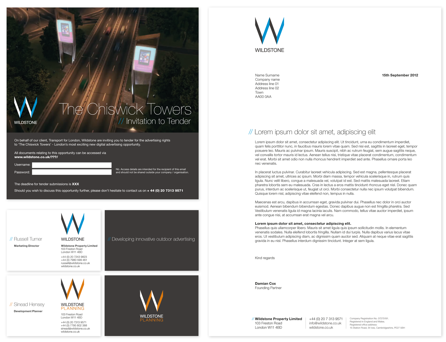
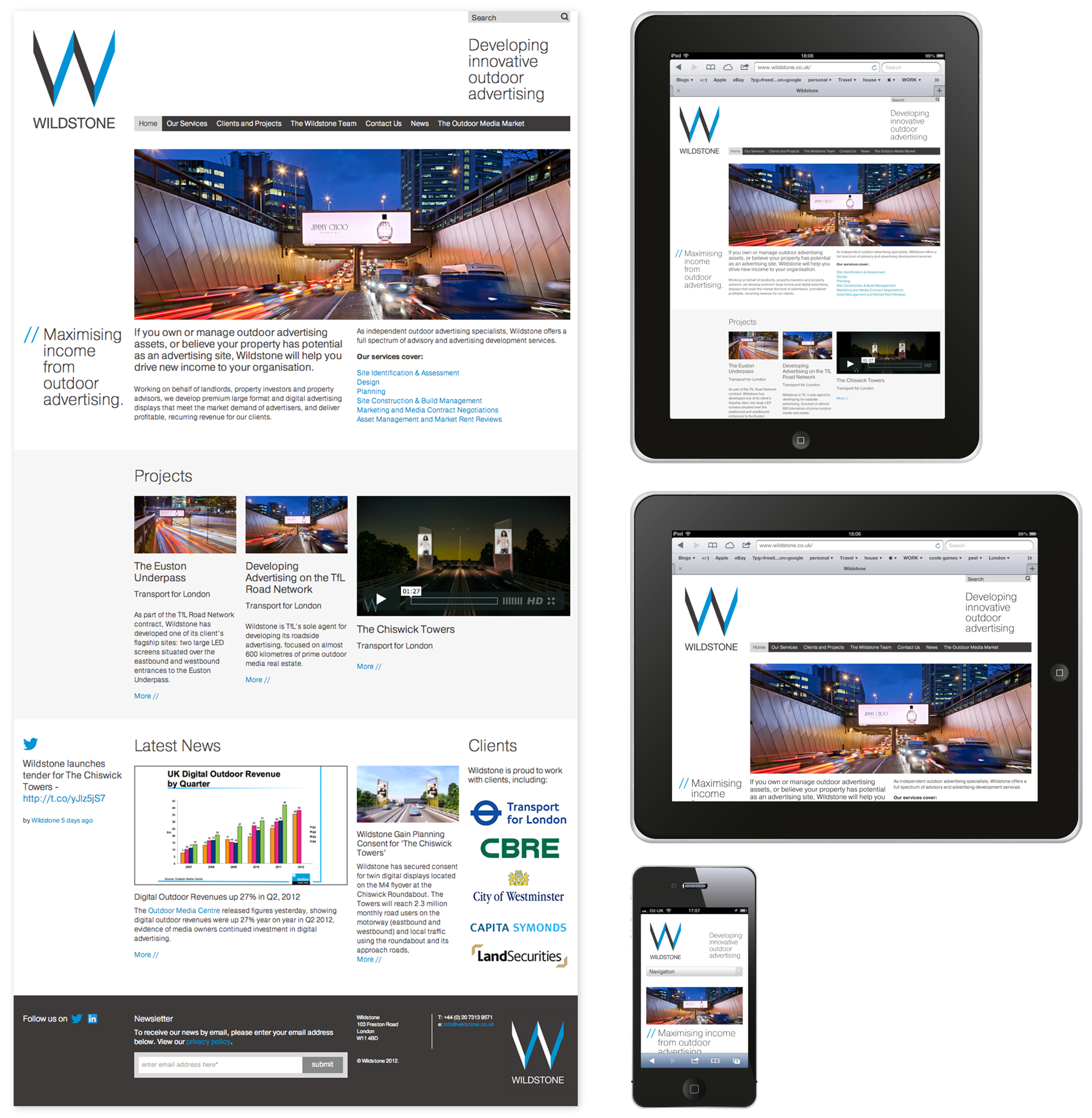
Design for a new visual identity for Outdoor Media Specialists, Wildstone, who develop prime outdoor digital and large format advertising sites, helping landlords and property developers as well as local authorities turn passive spaces into highly desirable media locations.

The brief was to evolve the existing logo and then create a strong visual language that could be used across all their print and digital communications.

The final design uses a tight grid structure, colour palette and use of typography to create a unified identity. The samples below are of the guidelines, stationery, invite and website. The website needed to be a responsive design that could be viewed on various devices and could be updated regularly by Wildstone themselves. Content in Motion and Pragmatic Web were fantastic at following my designs through to final build.

Download a sample sheet